
Mobile-First Website Design in Bangalore: Why It Matters for Local Businesses
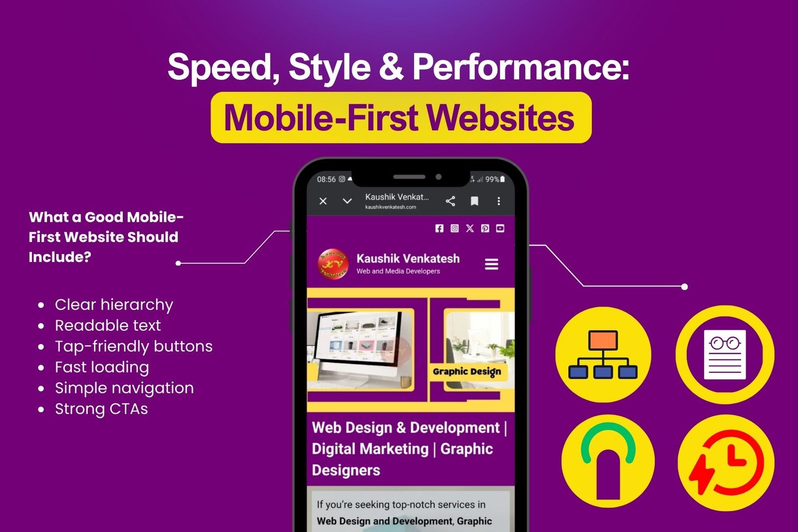
- a clearer information hierarchy
- shorter, easier-to-scan sections
- simplified navigation
- tap-friendly buttons
- fast-loading media
- stronger focus on user actions
The result is a website that works well where most users are actually browsing.
Our website maintenance and support services cover the core technical and content tasks your site needs on an ongoing basis.
Bangalore is a fast-moving market, and many users browse on the go. They may be looking for services, comparing businesses, or making quick enquiries from their phones. In that environment, a poor mobile experience can cost you a lead.
A mobile-first website helps because it:
- makes information easier to find quickly
- reduces friction on smaller screens
- improves page speed and usability
- supports more calls, messages, and form submissions
- creates a stronger first impression
- helps users trust your business faster
For service businesses, consultants, clinics, agencies, contractors, and local brands in Bangalore, mobile-first design is often the difference between a user bouncing and a user enquiring.
If you need a complete solution for building and launching your website, explore our Website Design & Development in Bangalore service.
Mobile-first and responsive design are related, but they are not the same.
Responsive design means your website adapts to different screen sizes.
Mobile-first design means your website is intentionally planned for mobile users from the start.
That distinction matters because the priorities are different.
A responsive site might still feel like a desktop page compressed onto a phone. A mobile-first site, on the other hand, is structured around mobile behaviour:
- what users need immediately
- where they expect to tap
- how much content they can comfortably read
- how quickly they can take action
This is why mobile-first thinking often produces better usability and stronger conversion performance.
A strong mobile-first website is built around real user behaviour. It should be easy to understand, easy to navigate, and easy to act on.
Here are the key elements:
- who you are
- what you do
- where you work
- how users can contact you
Many websites look fine on desktop but struggle on mobile. Some of the most common problems include:
- text that is too small
- buttons that are hard to tap
- too much content crowded into one section
- slow-loading images
- confusing navigation
- forms that are difficult to complete
- no clear call to action
- important information buried too far down the page
These issues can quietly reduce leads even if the website looks attractive overall.
Mobile-first design is good for users, but it also supports search performance. Search engines increasingly value pages that are easy to use on mobile devices. That means your page structure, speed, readability, and engagement all matter.
A mobile-first website can help by:
- improving user experience
- reducing bounce rates
- increasing time on page
- making content easier to crawl and understand
- helping users complete key actions faster
In other words, better mobile design can support both rankings and conversions.
To improve your visibility, rankings, and organic traffic, take a look at our search engine optimization services.
If your website gets a lot of mobile traffic, it may be time to rethink the structure. A redesign is worth considering if:
- improving user experience
- reducing bounce rates
- increasing time on page
- making content easier to crawl and understand
- helping users complete key actions faster
In other words, better mobile design can support both rankings and conversions.
Our approach focuses on usability, clarity, and search-friendly structure. We start by understanding the business goal, the audience, and the most important action the page should drive.
From there, we plan the content hierarchy for mobile first, then expand the layout for larger screens. That ensures the website feels purposeful on every device instead of simply “shrinking” a desktop design.
We also keep performance and structure in mind so the site supports both users and search engines. That includes clear headings, intuitive navigation, strong calls to action, and internal links that help people explore related services.
If you need a full website build rather than just mobile UX improvements, you can explore our website designers in Bangalore service.
Mobile-first website design is no longer optional for businesses that want to stay competitive online. If your audience is browsing on phones, your website needs to be fast, clear, and easy to use on those devices first.
For Bangalore businesses, this can improve user experience, boost enquiries, and create a stronger foundation for local SEO. The goal is not just to make a site look good — it is to make sure the right people can find it, understand it, and contact you without friction.
A mobile-first website gives you a better chance of turning visitors into customers. And in a market like Bangalore, that advantage matters.
To see everything we offer across design, development, SEO, and marketing, visit our services page.
If you’d like to enquire about a project or request a quote, simply contact us today.